The Mobile Debate That Every Business Owner Needs to Settle
More than 63% of all web traffic now comes from mobile devices. Yet many businesses still run websites that weren’t truly built with mobile users in mind. If your site isn’t delivering a fast, smooth, and intuitive experience on a smartphone, you’re not just losing visitors, you’re losing customers.
The optimization of mobile websites has been proven to be the greatest consideration for both the users’ convenience and for performance within the search engines. And here comes the catch which strategy should you choose for your website, mobile-first or responsive design? The year 2026 is here, and there is more to it than meets the eye.
This guide breaks down both approaches, compares them head-to-head, and gives you the practical mobile UX best practices you need to make the right call for your business.
What Is Mobile-First Design?
Mobile-first design means building your website starting with the smallest screen, the mobile view and then scaling up to tablet and desktop. Instead of shrinking a desktop site down, you design the core experience for mobile users first.
This philosophy was born out of necessity. As mobile usage overtook desktop, designers and developers realised that trying to squeeze a complex desktop layout onto a 375px screen was always a compromise. Mobile-first flips that process entirely.
It is quite natural for optimizing mobile websites using this strategy. It will make sure that you focus on all that is really important like fast page loads, effective call-to-actions, convenient navigation and legible text without all the additional stuff.
What Is Responsive Design?
The process of designing and developing a website such that it is optimized to automatically adapt to different device screens is called responsive design. This involves fluid grids, images, and CSS media queries.
Responsive design became an industry standard in 2012 and continues to be widely used to this day. Responsive design is a good basis for mobile optimization when applied properly. The main distinction between mobile-first and responsive design is that with the latter approach the design starts with the desktop version and then works its way down, while the opposite happens with the former approach.
With responsive design, a business already having an existing desktop website can obtain a great mobile experience without a complete redesign.
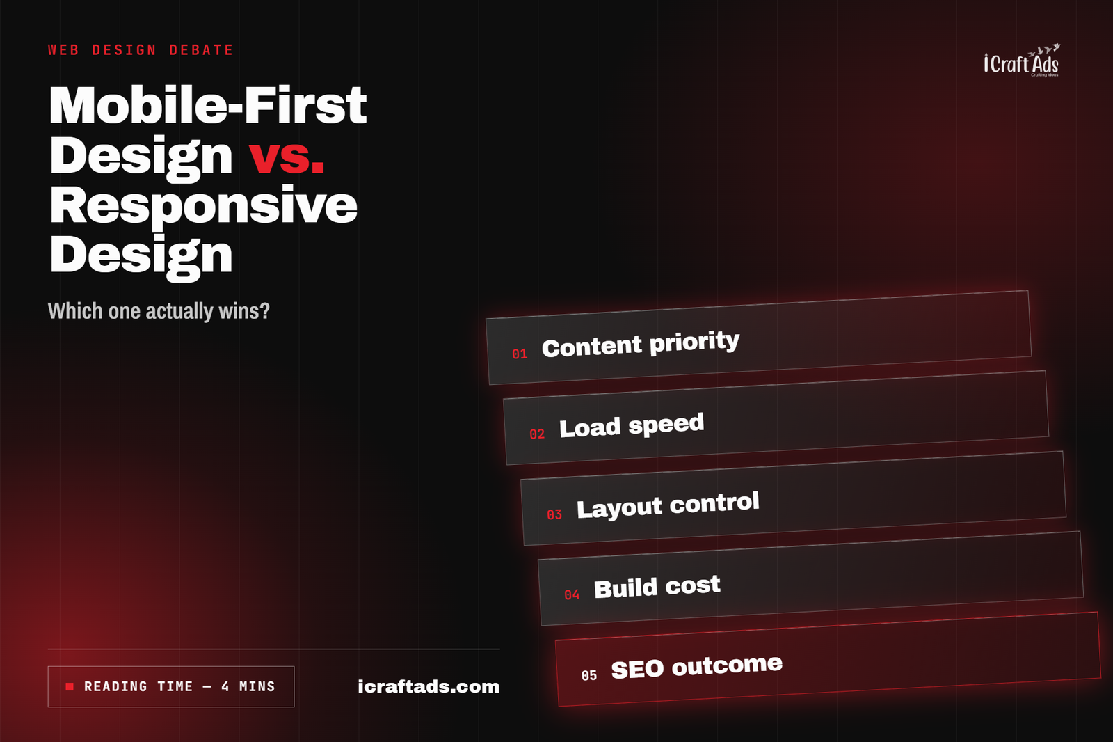
Mobile-First vs. Responsive Design: The Straightforward Comparison
Take a look at the table below that shows the difference between the two design types.
| Feature | Mobile-First Design | Responsive Design |
| Design Starting Point | Mobile screens first | Desktop screens first |
| Google Ranking Preference | ✅ Strongly favoured | ⚠️ Less prioritised |
| Page Speed (Mobile) | ✅ Faster | ⚠️ Can be slower |
| Development Effort | Moderate | Moderate |
| Best For | New builds & startups | Established desktop sites |
| UX on Mobile | ✅ Excellent | Good, but adapted |
| Core Web Vitals Score | ✅ Higher typically | Variable |
Why Mobile-First Is Better for Search Engine Optimization and Mobile Websites Optimization
1. Google Indexes Mobile First
As of 2019, Google indexes web pages using the mobile-first index. In other words, when indexing a website, Google takes into account only its mobile version. That means that even if your website is awesome on a desktop device, but bad on a mobile one – it will have poor search engine rankings.
Mobile-first designs are completely in line with the way Google ranks your website and its content. Therefore, Mobile-first design is an obvious winner when it comes to optimizing websites for mobile devices.
2. Page Speed and Core Web Vitals
Core Web Vitals – Largest Contentful Paint (LCP), Interaction to Next Paint (INP), and Cumulative Layout Shift (CLS) are ranking factors in 2026. Mobile-first websites tend to score better on these metrics because they’re built lean from the ground up, without the weight of desktop-heavy assets being scaled down.
Responsive sites can absolutely pass Core Web Vitals, but they require more deliberate optimisation to get there. Mobile-first gives you a head start on mobile website optimization performance out of the box.
3. User Experience and Conversion Rates
Here’s a number worth remembering users are 5x more likely to abandon a task on a poorly performing mobile site. Mobile UX best practices thumb-friendly clickable targets, minimal form fields, fast load times, and clear CTAs are all easier to achieve when mobile is your design starting point, not an afterthought.
When Responsive Design Still Makes Perfect Sense
Mobile-first isn’t always the right move. Here are some reasons why responsive design will still be the better option:
- If you have an existing website that receives desktop traffic and you don’t want to disrupt this
- If your primary user base uses desktops (this applies to many B2B, law, and financial websites)
- If you don’t have enough budget or time for a complete site redesign
- If your current site was built using a good responsive design framework
The trick is to implement mobile UX practices in your responsive design framework. A responsive site with good performance, mobile navigation, fast loading images, and optimized touch interactions will yield great results as a mobile website optimization strategy.
5 Mobile UX Practices That Every Website Should Have in 2026
1. Ensure That Clickable Targets Are Big Enough
The buttons and links on your website need to have at least 48×48 pixels with space in between. Small clickable targets are among the most frequent mistakes in mobile UX design. They irritate the users and cause the bounce rate to rise.
2. Reduce Page Loading to Less Than 3 Seconds
People browsing on their mobile device get frustrated quickly. Make sure to compress your images (using WebP format), activate lazy loading, and reduce the number of CSS and JavaScript files. Google’s PageSpeed Insights will be of great help to you when dealing with mobile SEO speed issues.
3. Optimize for Thumb Navigation
The vast majority of people use only their thumb to navigate on their mobile device. Therefore, place all important elements of navigation, such as menus, calls to action, links, etc., in the bottom half of the screen.
4. Simplify Forms for Mobile
Long forms kill mobile conversions. For any form on mobile, ask only for what’s essential, use auto-fill wherever possible, and make input fields large and clearly labelled. This is one of the highest-impact mobile UX best practices for lead generation and e-commerce sites.
5. Testing Your Site on Actual Devices Rather Than Emulators
Emulators cannot test all potential problems in your site. You should conduct tests of your web page on actual iOS and Android devices to detect any issues that emulators might not be able to find. Use this along with the mobile usability report on Google Search Console.
Conclusion: Mobile-First Is the Standard, While Responsive Is Just the Minimum Requirement
It’s clear by 2026 that mobile website optimization is a must-have and mobile-first is the best approach that you can take in order to accomplish that task. It meets Google indexing needs, enhances Core Web Vitals, and provides the mobile design requirements that modern users want to see.
However, if you have an existing website, there’s still room for responsive design to help you get the desired results more efficiently and economically.
Nevertheless, if you are starting from scratch, then it’s time to choose the mobile-first approach. The most successful companies on mobile in 2026 took advantage of it earlier. They built smart, they built fast, and they put mobile users first. Your website should do the same.
Frequently Asked Questions (FAQs)
– Is mobile-first design more expensive than responsive design?
Not necessarily. For new website builds, mobile-first design costs about the same as responsive design. It lies in the approach, but not in the pricing itself. If we are talking about businesses that wish to make some updates to their current website, then the cost would differ depending on the degree of restructuring required.
– Is it possible to combine the approach of mobile first and responsive design?
Yes, and moreover, this is the optimal option. Modern web sites should be developed following the approach of mobile first and at the same time being responsive.
– Does mobile-first design affect desktop users negatively?
No. A mobile-first site is designed to scale beautifully to larger screens. In most cases, clients report that the desktop version of a mobile-first site is actually cleaner, faster, and better organised than their previous desktop-only design.